Layout, Pages & Media
How to arrange a form: label and hint placement, widths, sections and columns, multi-page forms, repeatable sections, and images and video.
Where layout settings live
FormAssembly keeps layout settings on three surfaces inside a Collect step. Select a field to open its settings and set label position, hint position, width and height for that field alone. Open Step settings in the Collect step header to set the form's defaults, including Default label position and the review switch. Open Pages in the Collect step header to split the form across pages.
To add fields and open field settings, see Designing Forms.
How do I position labels?
A field's label position is set per field, and the form's default comes from Step settings › Default label position. The options are:
- Above places the label above the input. This is the default.
- Below places the label below the input.
- Left-aligned puts the label in a column to the left of the input, aligned left.
- Right-aligned puts the label in that same left-hand column, aligned right.
- Hidden keeps the label's space in the layout but does not show the text, so inputs stay aligned with the fields around them.
- Inside floats the label inside the input. It moves above the input's content once the field has focus or a value.
Inside is offered on short text, long text and number fields only. Other field types show their label above the field instead. Choosing Inside on a field clears its placeholder, and no placeholder shows while the label is inside, including one added later.
On narrow screens, side-by-side labels stack above the input so the form stays readable.
How do I position hints?
A hint is the helper text under a field's label. The field's settings offer Below or Tooltip.
Below places the hint between the label and the input, which is the default; with a Left-aligned, Right-aligned or Below label, the hint sits under the input. Tooltip replaces it with a small information icon next to the label; the respondent clicks or focuses the icon to read the hint, and presses Escape to dismiss it. Both positions are read out by screen readers.
How do I set field width and height?
Width is a slider that runs from Auto to 12 twelfths of the field's line. It sizes the whole field, label and hint included, and the input always fills the width you set. Width sits in the field's Appearance group.
A field with a width on its own line leaves the rest of the line empty: use a row instead.
The Height row has a Lines / px toggle. Lines run from 0 to 20 and count lines of text, so a long text field set to 5 lines shows five lines whatever the theme's font size. Pixels run from 0 to 400 and size the whole box. A value of 0 reads Auto in both units. Height has no effect on radio, checkbox, ranked-choice, rating or file upload fields, because their control is a container rather than a typed box.
Resize a field by dragging
- Select the field on the canvas.
- Find the grabber in the bottom corner of the field's input.
- Drag it sideways to set the width in twelfths of the line.
- On a long text field, drag down or up to set the height in lines.
With the grabber focused, the arrow keys do the same. A field inside a section with a column count has no grabber, because the columns set its width.
Form width
The overall form width is set by asking Fai in the chat box, which shows the placeholder "Ask Fai". A width set this way overrides the theme's Form max-width. Without one, the theme's Form max-width caps the form. See Themes & Branding.
Sections: style, columns and repeat
A section groups fields together and controls how they sit side by side. Select the section and press its pencil to open its settings. The panel's Layout group holds Style and Columns, and its Repeat group holds the repeat settings.
Style is Boxed, the default, which draws a border and background around the section, or Plain, which keeps the grouping without the box. A section that has a label shows the label as a heading.
Columns is Stacked, Row, 2, 3 or 4. Stacked gives each field its own line. Row puts the section's children on one line, each sized by its own width, and stacks them when the form is narrow. A number is a maximum: the section shows up to that many columns and collapses to fewer as the form narrows.
Repeat holds a Repeatable switch, Max instances (from 2 to 1,000, or blank for no limit) and an Add button label.
Layouts respond to the space the form has, so a form in a narrow sidebar or a modal reflows the way it does on a phone.
You can also ask Fai to change any of these settings.
To show or hide a field or section, see Conditions & Validation.
Choice layouts
Radio and checkbox fields have their own choice layout, set to Columns or Rows plus a count. By default, options are listed one per line, which is Columns: 1. Choose Rows: 1 to flow the options along one line that wraps when it runs out of room. Columns with a count of 2 or more lays the options out in a grid that reduces its column count as the form narrows.
Repeatable sections
A repeatable section lets a respondent add more entries of the same group of fields, such as several line items or several family members. Respondents add an entry with the Add another button (or the section's Add button label), and the button disappears once the section reaches Max instances or the form reaches 1,000 entries.
A repeatable section records each entry, including entries the respondent left blank. A repeatable section that a condition hides records no entries. Removing an entry moves the entries below it up, and each keeps its answers and uploaded files.
A few limits apply:
- FormAssembly cuts a submission that claims more entries than the maximum down to the maximum.
- A form has a ceiling of 1,000 entries across all of its repeatable sections, counting every level of nesting.
- The first entry cannot be removed.
- Use Test to add entries the way a respondent will.
To total values across repeat entries, see Calculations & Default Values.
How do I build a multi-page form?
Pages, not Fai, are the main way to split a long form. Click Pages in the Collect step header to open the Pages panel, then click Add page. Once the form has more than one page, a page tab strip appears above the form on the canvas with its own Add page shortcut.
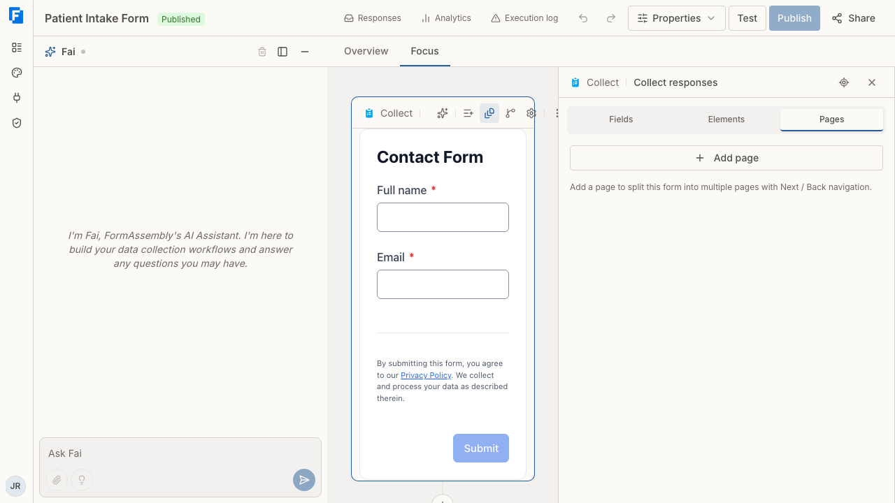
Once the form has more than one page, the Pages panel shows four display options:
- Show page titles prints each page's title above its fields, and is on by default.
- Show page numbers adds the page number alongside the title.
- Show navigation tabs adds a tab per page above the form so respondents can move between pages directly.
- Show progress bar adds a bar showing how far through the pages the respondent is, and is off by default. The bar's appearance depends on the theme.
On Next, a page with errors keeps the respondent on that page. A navigation tab jumps to its page without checking the current one.
Reorder pages by dragging them in the panel or by using the arrow keys. Use Copy page to duplicate a page with its fields. Delete page and Disable multi-page, which merges every page into one, both ask for confirmation first.
A single-page form shows only Add page in the Pages panel, unless its page already has a display condition. The panel then also lists that page so you can see the condition and remove it.
Page display conditions
Give any page after the first a display condition with Add display condition, or Edit display condition once it has one. Previous and Next skip a page a condition hides, and that page's tab is removed from the respondent's navigation tabs.
Moving fields between pages
A toggle next to the page strip switches between single page view, which shows one page at a time, and stacked page view, which shows every page down the canvas.
Fields can be dragged between pages only in stacked page view. In single page view, use Move to page, which is offered for a field, Image or Video that is not inside a section. To move one field out of a section onto another page, switch to stacked page view and drag it.
Moving a field so that a condition now refers to a later field still moves the field, and a notice tells you that publishing is blocked until you fix the condition.
Submitting a multi-page form
Moving between pages does not submit answers. The form submits every answer at once, and only when the respondent selects Submit on the final page.
Review before submitting
Review before submit is a switch in Step settings, and it works on single-page and multi-page forms. With it on, the respondent sees a "Review your answers" summary before submitting, with Back and Submit.
The summary lists the answers by page. Hidden fields are left out, a blank answer shows "—", and repeat entries read "Entry 1", "Entry 2".
Image elements
An Image shows a picture on the form and submits no value. Add one from the Elements tab, then set its link and options. Image and Video elements never appear in responses, exports or connector mappings.
Paste an https link to the picture. An http:// link shows "Use a secure link that starts with https://."
Alt text is always on the element. Write alt text that describes the picture, and leave it empty only for a decorative image; screen readers then skip it.
Size is Small (25%), Medium (50%) or Full width, which is the default. Alignment is Start, Center or End, with Start the default. An image never shows wider than its own natural width.
Video elements
A Video embeds one YouTube video on the form and submits no value. Add one from the Elements tab.
Paste a link to one YouTube video and give the video a Title. Screen readers read the title as the player's name, and FormAssembly shows the title when the video cannot play. Watch links, youtu.be short links, Shorts links, embed links and live links all work. A channel, playlist or search link shows "Use a link to one YouTube video, not a channel, playlist or search." A link to another site shows "Use a link to a YouTube video."
The player keeps the link's start time, end time, playlist and caption language. A video cannot autoplay, hide its controls or turn captions off.
Size is Medium or Full width; there is no Small. When the form is narrower than 640 pixels, on a phone or in a narrow embed, a video is always full width. A Shorts video plays in a tall player that is never wider than 360 pixels. Alignment is Start, Center or End, as for an Image.
A youtube-nocookie.com link plays in YouTube's privacy-enhanced mode. Any other link plays from www.youtube.com. You choose by the link you paste.
FormAssembly removes a YouTube <iframe> pasted into an HTML block, so use the Video element to show a video. You can also ask Fai to add an Image or a Video; Fai asks you for the link and never makes one up.
Media in a row
An Image or a Video can sit in a row beside fields. Its size is then its share of the row, the same way a field's width is a share of the row. A size too wide for the room left in the row is turned off.
When respondents see media from other websites
On a respondent's form, images and video hosted on other websites show only after the respondent allows Images and video in the consent banner. This includes pictures, video and audio inside an HTML block. Until the respondent allows them, they take no space on the form.
Pictures that FormAssembly hosts, icons and pictures uploaded into FormAssembly are not affected and show right away. What Respondents See covers the consent banner itself.
When a video can't play
If the site a form is embedded on blocks the player, respondents see "This video couldn't be loaded." and a "Watch it on YouTube" link. With JavaScript turned off, respondents see the video's title and that link. The rest of the form still works in both cases.
Publishing and testing media
A draft can hold an Image or a Video with no link. Publishing is refused when an Image has no link or a link that is not a valid https web address, or when a Video has no link, no title, or a link that is not a supported video link.
The builder canvas never plays a video; it shows a placeholder at the player's size. The builder also always shows images from other websites, whatever a respondent would see. Click Test to watch a video and to see the form as a respondent sees it.
Tips & Troubleshooting
- "Inside" is missing from a field's label position list. Inside is offered on short text, long text and number fields only. Other field types show their label above the field, including when the form default is set to Inside.
- A field has no resize grabber. The field is inside a section with a column count, where the columns set each field's width. Change the section's Columns setting to Stacked or Row to size the field yourself.
- You want to try repeat entries. Click Test to add entries the way a respondent will.
- A video shows a grey placeholder on the canvas. The builder never loads a player. Click Test to watch the video.
- Images or a video are missing on a respondent's form. The respondent has not allowed Images and video in the consent banner, so nothing loads from the other website. See What Respondents See for the banner.
- Publishing is blocked after you move a field to another page. A condition now refers to a field on a later page. Move the field back, or edit the condition so it refers only to earlier answers.
- A field is dragged into the wrong place between pages. Dragging between pages works only in stacked page view. In single page view, use Move to page instead.
Was this article helpful?